ARQTRON / TEAM BRAND RESOURCE
One brand.
A shared reference.
Everything we need to show up consistently. Use these master logos, colors and typography when creating websites, proposals, presentations and social content for ARQTRON.
01 / LOGO LIBRARY
A recognizable signature.
Use the horizontal lockup by default. Choose SVG for scalable artwork and PNG for documents or tools that need an image.
02 / Horizontal lockup
Symbol and custom ARQTRON lettering, used on the website.









07 / Dark icon
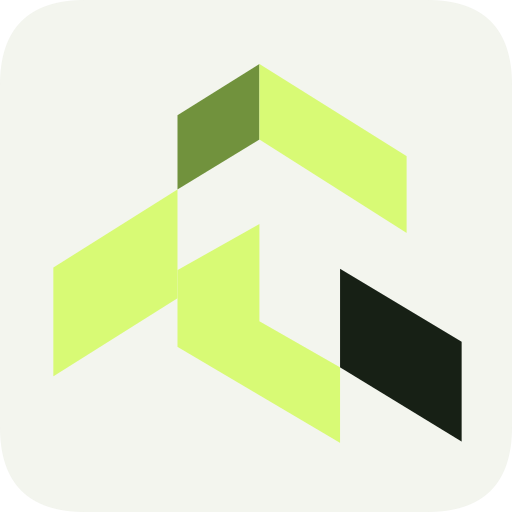
The website favicon: lime symbol and a light tail on graphite.


02 / COLOR SYSTEM
A quiet foundation.
A clear signal.
Graphite and ivory do the heavy lifting. Acid lime brings attention to the moments that matter.
01 / Primary colors
Graphite
The foundation. Page backgrounds and dark brand applications.
- HEX
- #111411
- RGB
- 17, 20, 17
Ivory
Reading surfaces and primary text on graphite.
- HEX
- #F3F5EE
- RGB
- 243, 245, 238
Acid lime
The signal. Primary actions, links and selected brand details.
- HEX
- #D8FA75
- RGB
- 216, 250, 117
02 / Supporting colors
Forest surface
Cards and panels that sit above the dark foundation.
- HEX
- #1B211B
- RGB
- 27, 33, 27
Muted sage
Supporting copy and captions on dark surfaces.
- HEX
- #ADB6A8
- RGB
- 173, 182, 168
Deep ink
Text on ivory and acid lime; light-background logo artwork.
- HEX
- #172015
- RGB
- 23, 32, 21
Forest border
Quiet dividers and card edges. Use brighter cues for interactive states.
- HEX
- #343D32
- RGB
- 52, 61, 50
Lime shade
Supporting accent and depth in the geometric logo.
- HEX
- #B6D455
- RGB
- 182, 212, 85
Deep sage
Supporting text on ivory reading surfaces.
- HEX
- #586251
- RGB
- 88, 98, 81
Use color with intent.
- Lead with graphite and ivory. Reserve lime for important actions and a few distinctive details.
- Pair acid lime with deep ink. Use a darker green for links on ivory; lime on ivory is too faint for text.
- Use muted sage on dark surfaces and deep sage on light ones. Forest border is a separator, not a text color.
- Keep logos in the supplied colors, with clear space and a background that makes the lettering readable. Avoid recoloring individual parts or placing them over busy images.
Readable combinations.
These solid-color pairs meet the WCAG AA minimum of 4.5:1 for regular text.
- Ivory on graphiteHeadings and body copy16.88:1
- Muted sage on graphiteSupporting copy8.86:1
- Deep ink on acid limePrimary actions14.24:1
- Deep sage on ivoryLight-surface captions5.82:1
03 / TYPOGRAPHY
Distinctive. Easy to read.
Two supporting typefaces, one clear hierarchy. The logo itself is custom vector lettering; use the artwork rather than typing a replacement.
Space Grotesk
Our primary typeface for headlines, body copy, navigation and buttons.
Built with intent.
Use 500–600 for headings and 400 for body copy. Keep tight tracking for large headings; let paragraphs breathe with a 1.6–1.75 line height. Start body copy at 16px on the web.
Space Grotesk license ↗Geist Mono
Our technical accent for section numbers, diagram labels, values and small identifiers.
02 / ENGINEER
03 / DELIVER
Use 400–500 and a little extra letter spacing for short labels. Keep long explanations in Space Grotesk. Monospace accents should support the message rather than compete with it.
Geist Mono license ↗04 / WORKING GUIDANCE
Consistency in the details.
A practical reference for the team. Carry the same identity from the website into every conversation and deliverable.
Give the mark room.
- Leave at least a quarter of the symbol’s width clear around a lockup. Keep text and other marks outside that space.
- Use the reversed lockup on graphite and the standard lockup on ivory. Use an icon when the full name would be too small to read.
- Scale proportionally. Keep the supplied geometry and colors; avoid stretching, rotating, adding shadows or recreating the lettering.
- Place logos on calm, solid backgrounds. Preview at the final output size before sharing.
Write like a useful partner.
Use ARQTRON in uppercase. Speak plainly about the business problem, the software and what happens next.
“Tell us what you’re building and where you’re stuck. We’ll help define a useful next step.”
- Name concrete work: custom software, SaaS, AI systems and workflow automation.
- Keep claims specific and support them with real project evidence. Publish client names, results and reviews only when verified and permitted.
- Favor clear sentences and direct actions. Avoid unexplained jargon, inflated promises and invented metrics.